My logo process takes about 2 months from start to finish- it’s a lot of time to get all down and dirty with my design work, fine tuning it and making it into the perfect expression of my client’s brand. During these past few weeks, I’ve been challenged more than ever and I feel like my skills have grown so much while working on the Creating This Life’s Logo. When Julie and I started talking she let me know up front that she knew she was looking for something classic and simple, but not exactly like the more whimsical designs that were in my portfolio. Can we still work together? While I’ll admit I do tend to lean towards a more whimsical style, I was excited to try my hand at a more classic, clean and timeless style. I think the meshing of our two styles came together to create a beautiful result!
![]() Julie had made a DIY Logo herself when she first created her blog and she was looking to step it up a notch. As part of the process I ask each client to collect images of what they’d like their brand to feel like (whether it be home decor, artwork, a craft, landscape..etc) so that we can create a style that’s perfect and unique to them. Julie’s inspirations were full of greenery, brick and modern victorian pieces.
Julie had made a DIY Logo herself when she first created her blog and she was looking to step it up a notch. As part of the process I ask each client to collect images of what they’d like their brand to feel like (whether it be home decor, artwork, a craft, landscape..etc) so that we can create a style that’s perfect and unique to them. Julie’s inspirations were full of greenery, brick and modern victorian pieces.
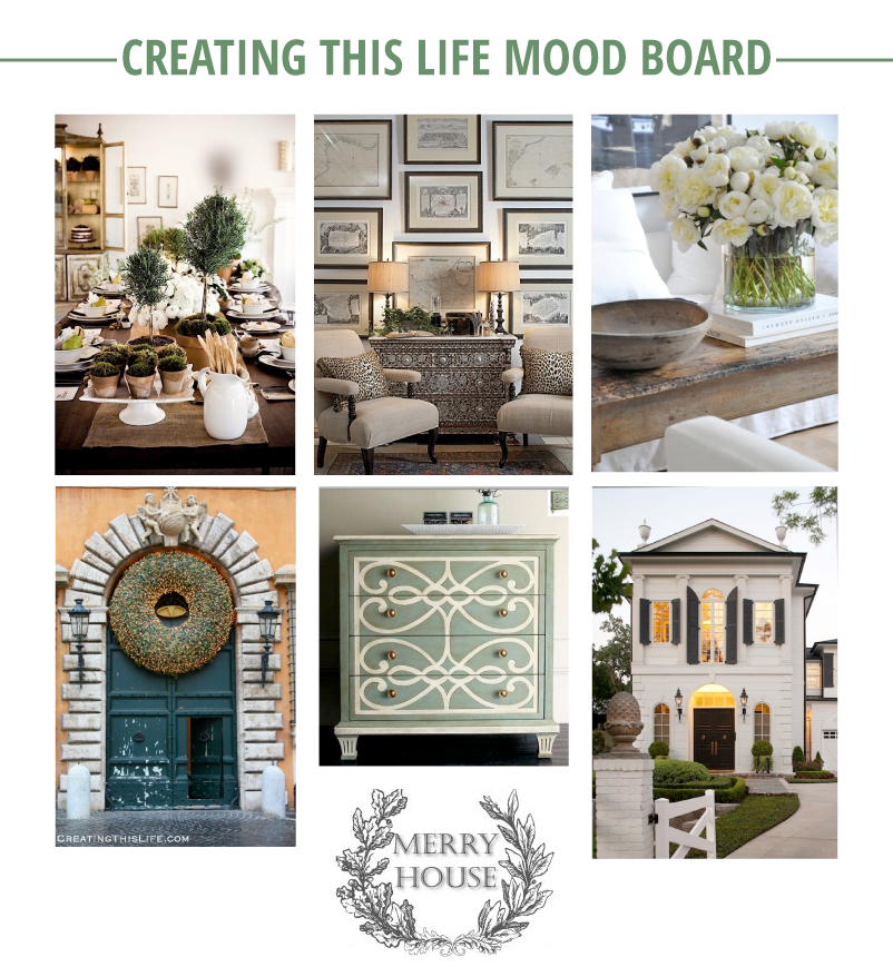
Bright whites and flowers. Like pages out of a home magazine, right? (if you’re wondering where any of these images were from you can find the links on her pinboard here)
![]() Remember how I said my skills were challenged and I was pushed to be better and create better? I knew the first draft wasn’t quite “it” but after getting Julie’s feedback I knew which way to go for the second revision!
Remember how I said my skills were challenged and I was pushed to be better and create better? I knew the first draft wasn’t quite “it” but after getting Julie’s feedback I knew which way to go for the second revision!
![]() Julie wanted some of the design to be a bit more intricate. After a lot of thought and pushing my creativity I decided to forgo my original work and opted for some hand drawn details (some of these were rough versions that would have been further cleaned up and polished had those been picked). And I think it paid off! Julie opted for an all grey logo to match her site and keep the focus on all the beautiful photos featured in each post. She loved the idea of vines on either side (and it was my favorite too!) so after trying out some different font combinations (with a lot of fun script fonts!) and a few small revisions to the vines, we had Julie’s perfect logo!
Julie wanted some of the design to be a bit more intricate. After a lot of thought and pushing my creativity I decided to forgo my original work and opted for some hand drawn details (some of these were rough versions that would have been further cleaned up and polished had those been picked). And I think it paid off! Julie opted for an all grey logo to match her site and keep the focus on all the beautiful photos featured in each post. She loved the idea of vines on either side (and it was my favorite too!) so after trying out some different font combinations (with a lot of fun script fonts!) and a few small revisions to the vines, we had Julie’s perfect logo!
Check out Julie’s new logo at the top of Creating This Life’s Blog– and look around her site it’s full of fresh flowers, estate sale finds and fun tours of old houses. I learned an awesome trick for easily polishing silver and I’ve gone back to this post on growing wheat grass multiple times (I know it seems a bit weird, but I really like the idea! Let’s be honest, though- who knows if I could keep it alive)
Liked this logo design? Need a new logo yourself? Contact me, let’s talk!
_________________________________________________________________________________________________________________
Like Me on Facebook
Check Out My Etsy Shop
Portfolio & Services
Oooh, LOVE the redesign! Brilliant work :)
Thanks, Natalia!
Love this look into your development process!
Thanks Ashley! It was fun to do it!
It’s always a pleasure to see the process of other designers :) And the result is lovely!
I never thought asking people to make a moodboard, I focus on the written questionnaire, but I do ask them to include a few reference pictures. I definitely see its value, and how it helped you develop the perfect logo for your client. It sounds like something I should try out as well!
I do a written questionnaire too! But the pictures are so helpful- I ask for either a pinterest board or they can send me images (some clients have used google drive to send me over a whole folder they have) and I love how it helps me get to know their style so well! You should definitely give it a try! I think it really helps your client feel more involved in the process.
Love it, so much better! Great redesign and love seeing your process!
Thanks so much, Leah!
I love so much seeing the whole creative process, thanks and great results!
I’m so glad you liked it! Thanks!
Nice! I love reading about the design process. Very cool.
Thanks Heather!
This is a beautiful logo! Thanks for sharing your process. :)
Thanks so much Katie!