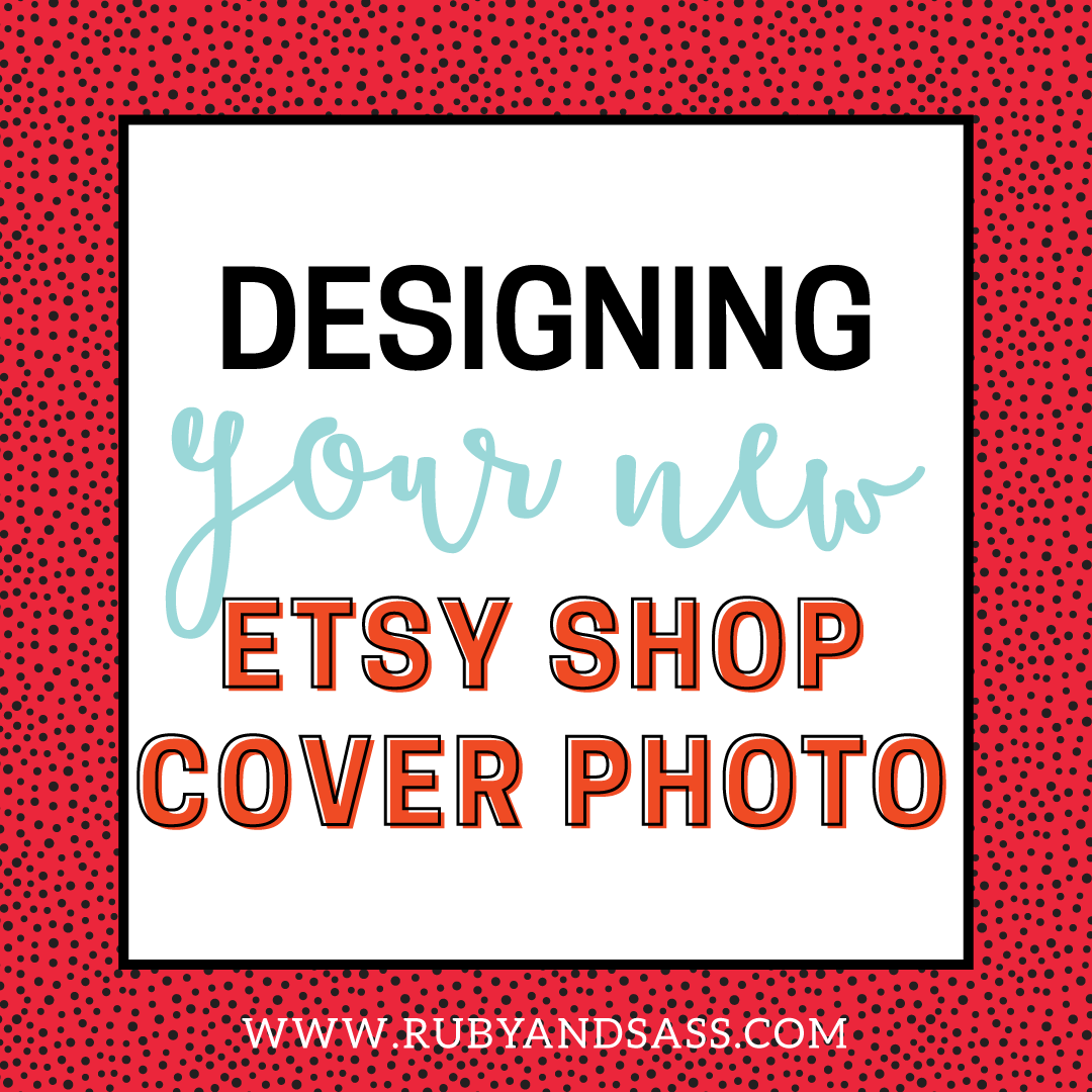
Etsy is changing up their shops once again! This time it involves changing out the Etsy shop banner for a more social media-esque cover photo with profile image.
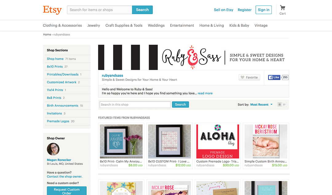
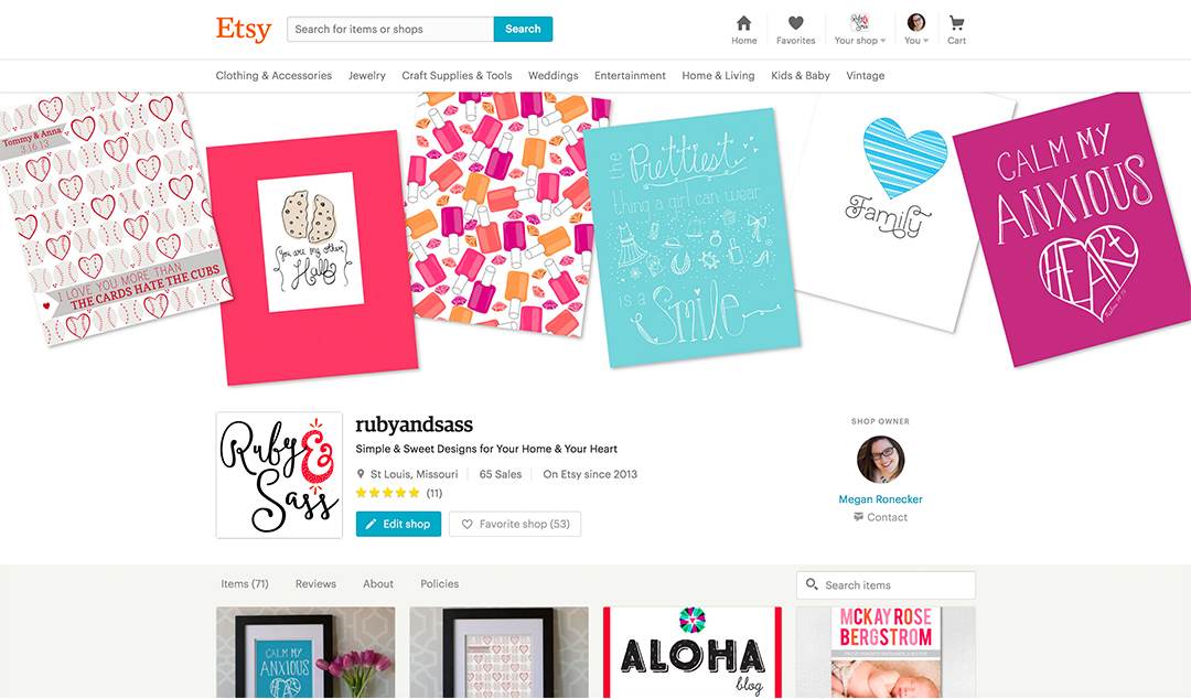
Here’s my shop now:
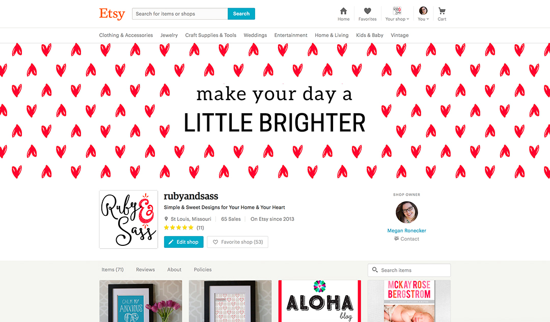
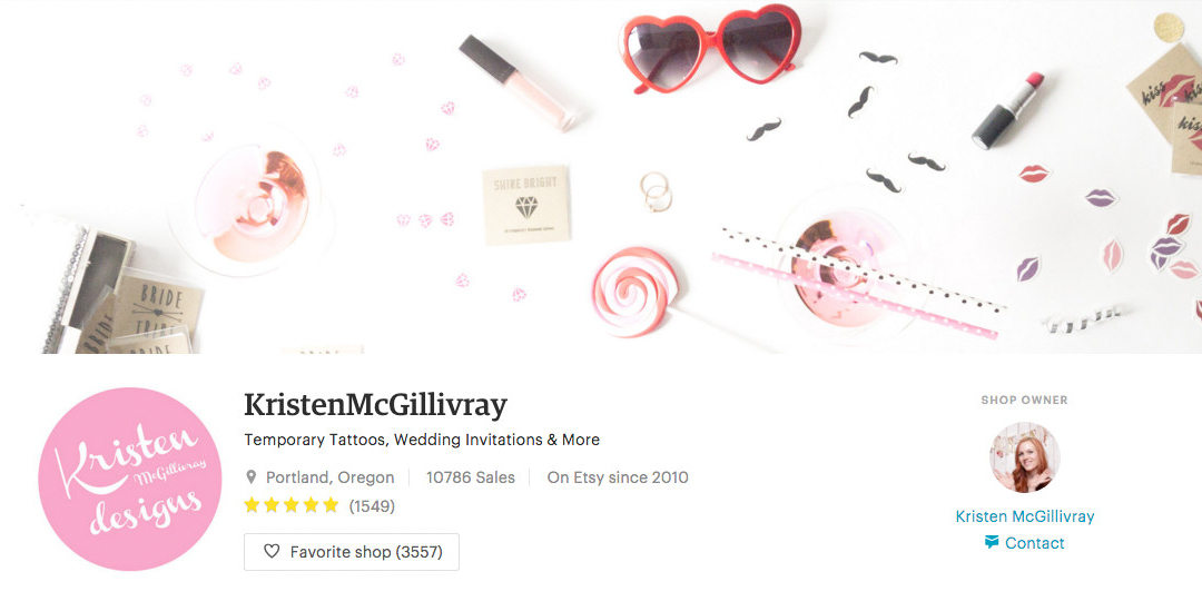
Here’s what it will look like when the new look goes live April 5th:
I’m excited about this change! I think the new Etsy shop cover photo gives a shop owner more real estate to make their shop feel a bit more like it’s their own even though they’re still on Etsy. But I can also see how non-designer shop owners might find it difficult to figure out how to use these cover photos to the best of their advantage.
Of course, my first tip for your Etsy shop cover photos is always to keep it branded. Use your brand colors, fonts and overall style. My second tip is not to overdo it with too much going on. This should be a pretty header and introduction to your shop. You still want your products to be what shines. This cover photo is just like the gift wrapping to the awesome present you’ve got underneath it and obviously, your main goal that people will purchase from your shop.
But what should you put in your Etsy shop cover photo?
Here are a few ideas:
A fun pattern or design
Do you have a popular pattern or design that you create on or with your products? Incorporate that into your cover photo. Make it more of a decoration to the top of your shop. Customers will see your work at the top and scroll down to see more! I’ve decided to use one of my branding patterns at the top for some fun visual interest (hearts galore!).
Here’s mine (same as above) that I’ll be using:
An Awesome Product Image
If you already excel in your shop photography, you probably have something that will work for this purpose! A lifestyle image of your product in use or sitting on a desk or in a house (depending on what your product is) would be great! Think Instagram for this one! What sort of “in use” shot would you use to promote your products on Instagram (or Facebook if you don’t use Instagram)? Then create one that’s formatted to the rectangular size constraints of the Etsy shop cover photo.
Here’s one I mocked up with the prints in my shop:
This is a great example from a Etsy’s seller handbook article:
credit: https://www.etsy.com/seller-handbook/article/the-ultimate-guide-to-telling-your-etsy/22722480541
A Flat Lay Image with Text
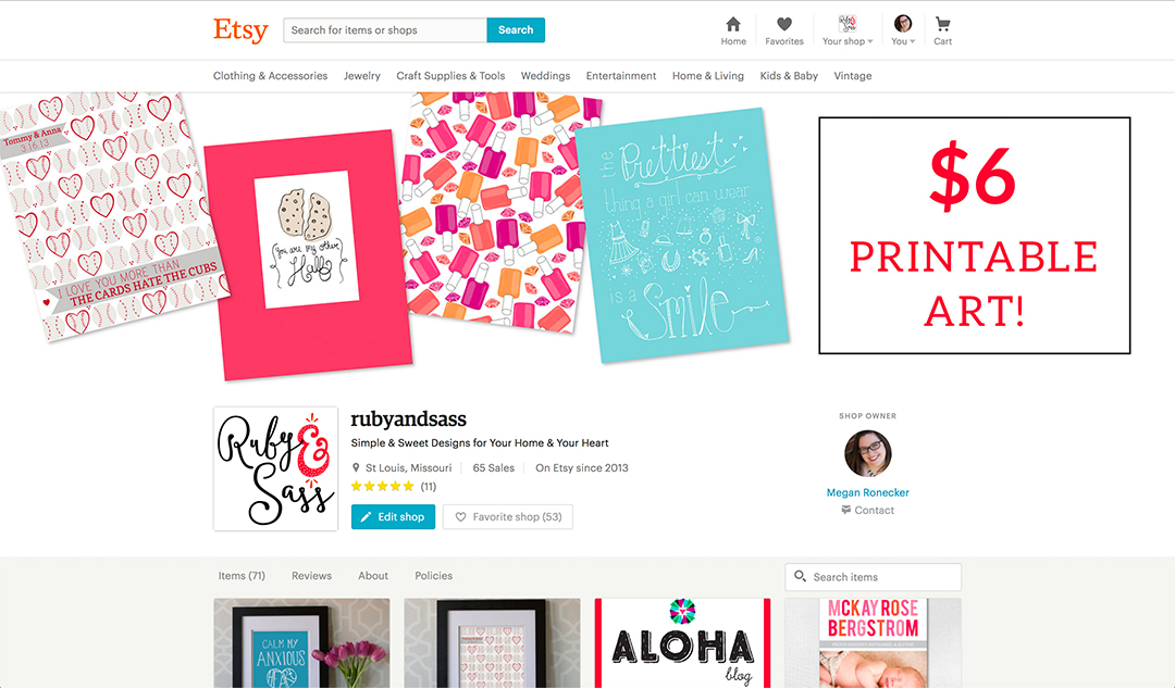
I want to preface this by saying, I’d go easy on the text for your cover photo. These are meant to be more visual then directly informative. BUT, adding a bit of text to advertise a sale, new product or highlight something special could work well. Try out an flay lay with space for text in the middle or on the side and let customers know what’s going on in your shop!
Here’s my product image modified for text:
Leaving the background white
I made a design choice to keep my cover photo backgrounds white because I think it makes the images feel like they’re intentionally part of the page design. They flow straight with the rest of the page’s white background. To get this effect, I just made sure that nothing from my design was touching the bottom edge of the image. If you have something at the bottom that’s being cut off, that will probably end up looking a bit funny. Of course, you’re not stuck leaving the background white if you don’t want to. Obviously, if you’re using a flat lay image, you won’t even need to worry about this. Alternatively though, you could always do a colored background and make it more of a page header.
So, try out a few different things like I did and see what you like the best! You have until April 5th to decide. Another fun thing would be to change them up with different sales or seasons. Or, you could feature a new item(s) in your cover photo each month. See what works for you in this eye catching space!
The Details:
New Banner Size: 3360 x 840 pixels
Programs to Design in: I used Illustrator, but Photoshop, Canva or PicMonkey are all great options!
Your New Shop Goes Live: April 5, 2016
Other Options: Etsy gives you an option to keep the banner or to not use any photo at all. I don’t recommend these options. The banner will be small like the old one, isn’t viewable on mobile, and will end up looking like you don’t update your shop. Leaving it blank is kind of like loosing out on the opportunity to show customers your style. If leaving it blank works with your shop brand then, go for it. BUT remember, you’re a creative! Come up with a creative use for that space. What can you show off there that highlights your products?
Are you an Etsy Seller? What do you think about this change? Have questions?
Hit me up in the comments!
Need help designing graphics for your Etsy Shop? Let’s Chat!
I like the new look. So, I’m excited when it goes live :)
I do too! I think it looks really fresh and fun :)
Good article and nice cover image ideas
Excellent ideas. I am going to use on of these ideas for my shop as well. I really liked the idea of banner with a price or a promotion that one shop is running to have on the banner. Thank you for the article.
Thank you so much for this article! I resized my original banner on PicMonkey to the specified size, but after I download it, it does not fit properly nor does it allow me to drag it ANYWHERE. Help!
Hi Glenna! Oh no! Can you email me a screenshot? megan@rubyandsass.com