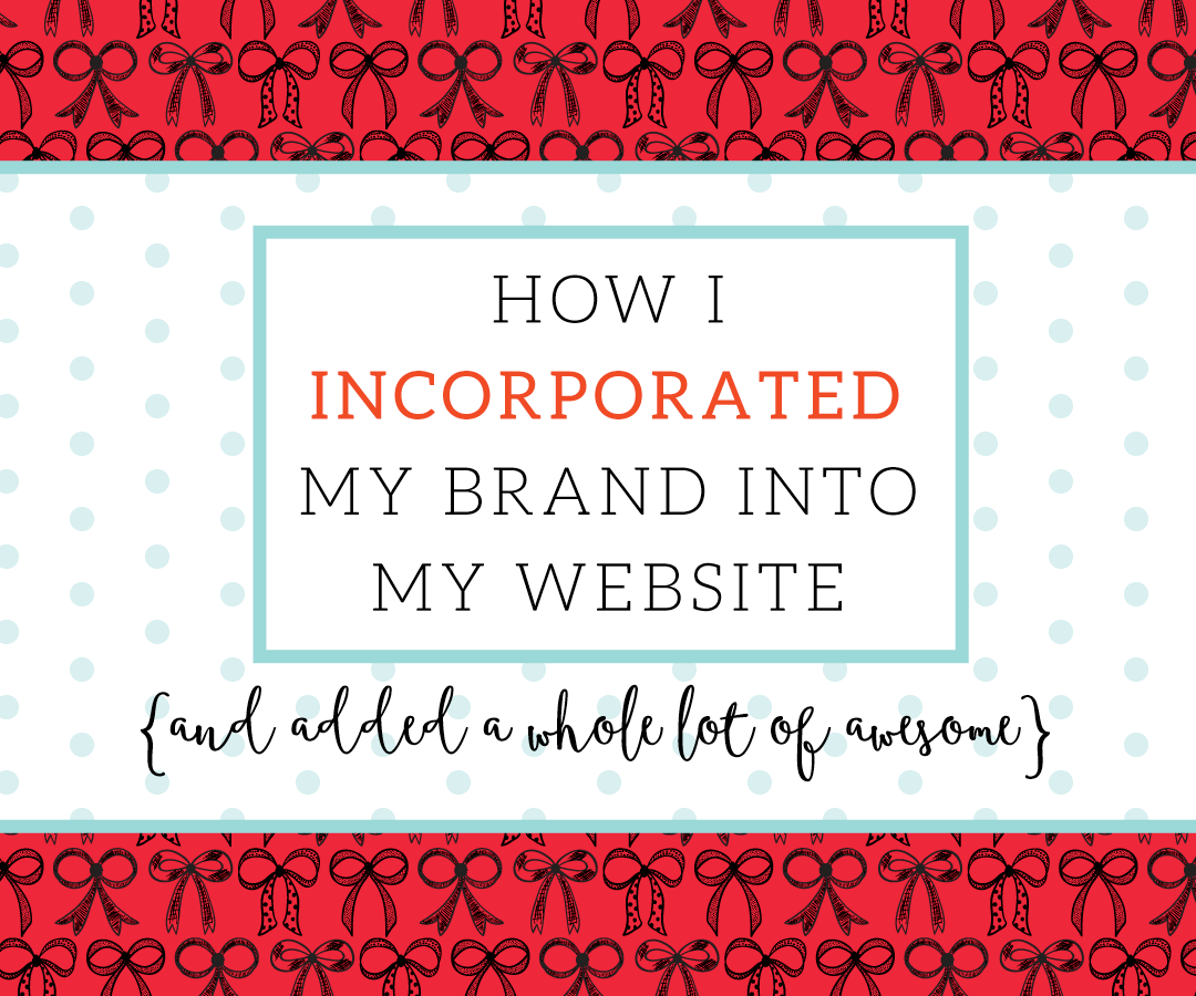
Well, Well, Well. In case you haven’t noticed (yeah, right) it’s looking completely different around here…and a whole lot more awesome! Since I finished my re-branding in May, I’ve been working on incorporating everything my new brand is into my website. My main goal with my new website was to create a site that not only appealed to my ideal clients (small business owners who like bright, bold and fun designs) but also showed off my design talent, but also gave potential clients a feel for what I can do for them. I’m so so so happy with the result! Here’s what I did to make it an eyeful of sass and delight:
INCORPORATED PATTERNS
This is probably by far my most favorite part of my site. I LOVE patterns. I love making them, I love looking at them, I love seeing others use them. They’re fun and verstile, and for me it was a quick and easy way to give my site some visual interest and texture without being too busy or distracting. Once I had them made as part of my branding, all I had to do was decide which one to use for which page (which, is actually harder said than done…they’re all just so pretty!). I still go back and forth on which one’s my favorite. I think it’s the one with the glasses…or the scattered dots…or the bows. See?! SO. HARD. But also so fun! The best part about it is, without even going to my portfolio visitors to my site get an idea of what my style is and the kinds of designs I do. Yay, for an awesome first impression (unless of course you don’t like bright colors and bold patterns..sorry, not sorry)
USED COLOR BOLDLY
Which brings me to my next point. I used my bold colors generously throughout my new site. Don’t get me wrong, I’m a big believer in white space (it’s imperative!). But, I’m also a big believer in going bold…or not doing it at all (I’d say go home, but I’m sitting at home as I write this soooo). I was going for fun, vibrant and sassy, and to do fun, vibrant and sassy you’ve got to do COLOR. And I’m so glad I did. A splash of color a dab of color there and it turns into a glorious, eye catching result.
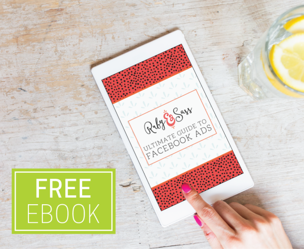
USED FULL WIDTH IMAGES
Full width websites aren’t anything new, but it’s new for me. When I designed my first website, full width websites were just becoming popular and I really didn’t like them much. But fast forward a few years later and I’ve grown to see the beauty and plus side of full width websites. I knew I wanted my next website to be full width. By using full width I was really able to do the graphics I designed justice. In fact, the full width headers are really the places where I predominantly used my brand elements. Each one has pattern and color with the heading or section name in my branded typeface for a really fun result.
What branding elements have you incorporated into your site? Do you think you need more and considering a redesign soon? Love the idea of using patterns as much as I do? Let me know your thoughts below!
WEBSITE CREDITS
Branding/Web Graphics/Design: Me, of course!
Development Help: A Place to Nest
Theme Used: Divi by Elegant Themes (affiliate link)
I really like your script typeface. The red really stands out. I used to think of red as really cheesy, but the way you have used the bright red is very classy. Great Job!
Thanks! I’m in love with this red too! Replaced the plain pink I had sooo well.
Beautiful! I LOVE your logo, Megan :) And your site does have a really nice cohesive brand feel. Thanks for the tips!
Thank you so much, Jackie! I’m glad the tips were helpful!
Love, love, love it!! Fun, sweet and sassy! :)
Exactly!! Thanks :)
The patterns are so fun. They’re bold but not overwhelming. Great job!
Fun and Bold! Yes! Thank you :)
The site looks gorgeous! I’m working with a designer for my own website, so this is super helpful. I hadn’t thought of patterns but will be adding that to my list – what a great idea! Thanks!
It’s such a fun thing to add in and pulls everything together nicely. Can’t wait to see what your site looks like! And thank you!
I love all of your patterns! Fun stuff.
Thanks Katie!!
Congrats! Love all the boldness- honestly makes me instantly feel like you are so much fun!
Aww, thanks! That’s what I was going for. Yay! :)
LOVE it!!
Thanks, girly!! :)