This is the post where I admit just how dorky I am. I get kind of giddy about editing photos in Instagram. Giddy as in when my husband takes a picture in tricky lighting or that I know isn’t going to look great straight out of the camera, I beg him to let me edit it before he posts it (to which he usually rolls his eyes and hands over his phone so I can work a bit of magic).
I see questions all the time in Facebook groups about what editing app people use and I’ve seen various responses. I’ve used VSCOcam and Afterlight (I still use Afterlight when I need to crop my photo to a square by adding white bars to the top and bottom), but honestly I think the editing tools in Instagram itself are really good on their own! And it makes it much less time consuming for me to just edit and post instead of uploading to a new app and then exporting to Instagram…yada yada yada. I know it’s not that many extra steps, but still.
I think it’s important to say that by editing in Instagram, I don’t mean just slapping on a filter and posting it. In fact, on my Ruby and Sass Instagram Page, I’ve never even used a filter on any images. I custom edit them all (dork alert, remember?). However if you’ve never had any photo editing experience, the terms in the editor can be confusing. And because I like to fight the war against ugly photos, I want to explain what each term is and how to use them. I also believe that if you’re using Instagram for your business it’s an extension of your brand and you should be using it as such. If you’re using the same old filters everyone and their 12 year kid is using, you are not standing out!
But first, here are a few tips that will help you get lovely images even before editing. Believe me, it’s a lot easier to edit a picture if it was taken well in the first place!
• Take images near a good source of lighting. This means your light is coming from one direction and you’re not mixing light sources- only use natural light or only use indoor lighting. I switch off indoor lighting and take my staged images by a window.
• I also use a white foam board to bounce light off my image. This was my old set up– window on the left, foam board on the right, subject in the middle.
• Take images directly from your phone’s camera. Don’t take the picture from another app. I’ll be honest, I don’t pretend to get all the logistics of why this is better, but I’ve read from multiple sources that your regular ol’ camera app on your phone is much better than ones other apps use.
• Adjust the exposure while taking the picture. I’m not sure if this works on other phones than the iPhone, but if you have ios6 or higher you can tap on different areas of your image and the camera will refocus and readjust the lighting to that area. That will then be the brightest part of the picture. Try tapping in a few places to see what looks best (faces, the subject you want to stand, a light source etc). Once you have your focus, you can drag your finger up for a brighter exposure (more lighting) or down for a darker exposure (less lighting)
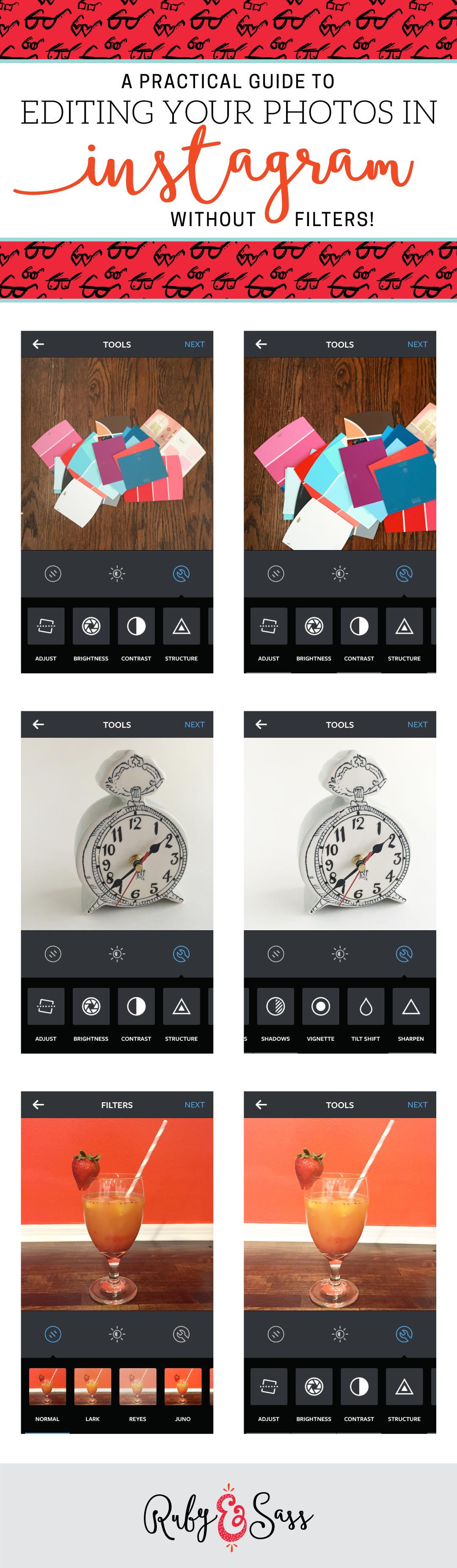
When you open your image in Instagram you’ll see filter choices at the bottom, ignore those! Right above the filters are 3 icons. Click on the one that looks like a tool (a wrench, I think? I’m a designer not a handyman) There you’ll see all of these delightful tools (all waaaay better than a wrench in my opinion) that will take your image to the next level:
Adjust: Crop your photo more, zoom in or out, rotate and skew your image. I use this mostly to get my images straight if I didn’t get a proportional image straight out of the camera.
Brightness: I almost always bump up the brightness! This is especially helpful if you didn’t have great light to take the picture from. Sometimes circumstances prohibit you from great lighting and that’s okay! Brightness is the first thing I adjust to get a better idea of the lighting I can expect from my image. I usually bump it up until the whites start to become too white. I like my images to look a little overexposed though, so test it out and see what you like. Watch out though- if you bump the brightness too high your image it will start to look grainy!
Contrast: Higher contrast will bump up the color, the sharpness and make the lines (and everything) more defined. The image itself will usually get darker. If you lower the contrast, colors will melt together a little more and lines (and everything) become softer. I usually go easy on contrast- but adding it in will define your image a little more. If you have a lot of shadows though, lowering the contrast will help that a little bit.
Structure: I haven’t found any good use for this. It makes your image a lot more defined, but also really grainy. Unless this is part of the look you’re going for (maybe vintage like images?), I don’t recommend it.
Warmth: Warmth, in photo editing terms, is adjusting the white balance. This means that it can make up for the lighting you took your picture in. If you took your picture in natural light, your image will look cooler and blue. If you took your image indoor lighting you image probably looks warm and more yellow (unless you use florescent, in which case it’s probably more blue). Now obviously, your image is not going to obviously scream out blue or yellow, but if you look closely there is a hint of it. Which way you edit depends on how you’ve branded your images to look. Mine tend to be more on the blue/cool side than the warmer side (unless it’s an intentionally sunny picture). For cooler images, slide to the left, for warmer images slide to the right. Be careful not to go too far or your image will actually look blue or yellow! Not good!
Saturation: I don’t use this much, but when I do I just barelllly bump it up or down. I think too much saturation and makes your image look weird. I use it when my image looks a bit washed out (especially when I’ve bumped up the highlights or brightness a little too much) and it brings back some color. If you’re going for a vintage look, you could be lowering saturation to make your colors look a little faded and washed out
Color: This is a new feature I haven’t really found a use for. You can add a color tint to the highlights or shadows in your image. Feel free to try it out! (I’d love to know if you have a good use for it!)
Fade: I don’t use this one much either, but I can see it’s use. It fades your entire image giving it a sort of polariod vintage look. If that’s what you’re going for in your brand, give it a try!
Highlights: This effects just the light areas of your image. Bumping it up will make them brighter, bringing it down will make them darker. I almost always use this! I usually bump up the highlights to make the whites whiter.
Shadows: This effects just the dark areas of your image. Bumping it up will make them lighter, bringing it down will make them darker. I use this to make my shadowed areas less noticeable. Be careful not to use this too drastically. It will either make your image too dark or make the image too soft and undefined (if this happens, you can bump up the contrast to get some definition back!).
Vignette: This adds shadows to the edges of your image. It’s a cool effect I don’t use this much because my images are bright and usually have light colored backgrounds. If you’re using this it’s probably part of your brand and you’re using it everytime you post an image.
Tilt Shift: This just adds a blur on part of your image. You can do it in radial (circular) form or a blurred line.
Sharpen: This is one of the newer tools and I love it! If you’ve lowered the contrast to get rid of shadows, this will add in a bit more definition to your image that lowering the contrast lost. I also use this when something in my image has text on it. It will make the text more clear and readable.
**And if at any time you want to see what your image looked like before editing you press your finger on the image it it will show you the original image. Handy dandy!
So, there you have it! Like anything else, this takes a bit of practice to get right. Just keep testing out what you’ve learned here on your images and before you know it you’ll have an eye for what you need to adjust before even opening the editor!
If you guys liked this post, I was considering also doing one with before and afters of my images and showing what I edited to make it look like that. Let me know below if that sounds interesting to you!
Also, in case you couldn’t tell, I LOVE Instagram and I’d love to see yours! Follow me here.

Fab recap!
I love the new “structure”, it really brings out textures. I do abstract paintings and before yhe “structure” adjustment they reflect less of my work and intention. Hope this is useful!
Oooh, how interesting!! I don’t usually have much need to add texture back in, but I’m going to keep that in mind.
These are all great tips! The Brightness and Sharpen features are my favorite on Instagram. By using just those two, pics look SOOOOOO much better. (And I love the tagline: “Fight the war against ugly photos”… hilarious!)
Loooove brightness and I’m really happy that they added sharpen! It really helps, especially with text. And thanks! You know somebody’s gotta do it :)
This is a really rich post. Thanks for sharing it! I’ve added it to +Pocket for later! :)
I’m so glad it was helpful!! Thanks Julienne :)
Love how practical this is – totally sharing it as a resource for clients! Thank you!
Oh, awesome!! Share away :) Thanks so much Jennifer!