I think pretty much anyone who does anything even slightly creative loves using, choosing and finding different fonts. At least I always have. I remember the day many, many years ago when I found dafont.com and realized that not only were there tons of options to choose from, but also that I would never be limited by the boring ol’ fonts that came on my computer. I was in heaven. I downloaded a TON and promptly started using them. Now, I’ve come a long way since then and know a thing or two more about typefaces and how to pick them- what makes a good typeface and how to spot a bad one from a mile away (Papyrus will never cease to make me cringe). Knowing how to pick the right fonts is even more important when choosing which ones you’ll use for your brand. Once you choose your fonts, those are the ones you’ll want to use for all of your graphics, your website and pretty much anything else you’ll be putting type on. Consistency is key!
For a quick crash course on different font categories read here first.
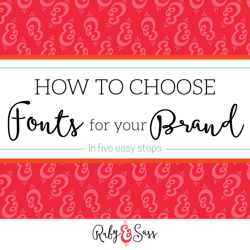
Here are 5 things to think about when you choose fonts for your brand:
1. Pick 2-3 fonts from different categories
I know it’s hard to narrow it down when there are soooo many pretty/fun/exciting fonts out there (At least for me it is. It’s harder than keeping up with our never-ending piles of laundry. And that’s saying something.) But sit down and pick out your favorites that express your brand (we’ll talk about that on #2) and try to limit it to 2-3 fonts. Each font should be from different categories (serif, sans-serif, display) and you should stay away from using fonts that look too similar. A chunky handwritten font would go great with skinny sans-serif or choose a beautiful calligraphic font paired with an elegant serif. The key is to find great fonts that pair well and illustrate your brand to a tee.
2. Think about what you want your brand to say
Do you want your brand to be trendy? Or timeless? Fun and Playful? Or Dependable and Conservative? Whimsical? Sassy? Soft and Dreamy? Whatever feel you’re going for, make sure the fonts you choose the embody that image. If you want your brand to feel timeless, a messy brush script isn’t for you. You might be better off with a traditional serif paired with an elegant script. If you’re more fun and playful, picking a handwritten or disheveled script might be the way to go. A general rule is that serifs tend to be more traditional and regal while sans-serifs are more modern (slab-serifs are kind of in between and err more on the modern side).
3. Make sure it’s readable
Talking about a messy brush script or disheveled handwritten font, I want to point out that this is the font you’ll be using to tell the world who you are and what you do. This means, you want everyone to be able to read your business name! Make sure whatever font you choose is legible and that you ask others if they can read it too! A high end ice cream company Jeni’s Ice Cream (they sell their ice cream for about $9 a pint, I’ve heard it’s delish, but I haven’t forked over the money to try it yet) made this mistake with their logo. It’s in a pretty handwritten type BUT instead of looking like it says “Jeni’s” it looks more like it spells another name for a male organ. Once you see it, you can’t unsee it. Don’t let bad planning ruin an (allegedly) amazing ice cream!
4. Don’t be afraid of paying for a font
This is a big one for me! In fact, I wrote an entire blog post on why you should pay for fonts. But an overview is, free fonts are free for everyone. You know what that means? Everyone is going to have those fonts and everyone is going to use them. Do you want a brand that looks like everyone else’s? Or do you want a brand that only looks like YOU? I know my answer to that. Now obviously, everyone can buy a paid font, but the chances are far less of everyone buying the exact same paid font to use for their brand. You have a much better chance of looking unique and also, of finding a font that fits your brand perfectly by opening your search up to paid fonts. Do you have to use paid fonts for your entire brand? No. I generally recommend using a paid display font (a pretty script or fun handwritten one) and then choosing free san/serif fonts to pair with it. The reason for this is because sans/serif fonts are harder to differentiate from each other, popular display fonts (I’m looking at you, Lobster) can be seen from a mile away.
5. Make sure you have the rights to use the fonts you’ve chosen for business use.
Almost all paid fonts will give you rights to use for business use, but free fonts are a bit trickier. In Dafont you can search for fonts that are 100% free or public domain. Those are pretty much the only free fonts you can use for business purposes. Anything with “Personal Use” is not okay to use for any business purpose (though there may be an option to purchase rights to). Where can you find out if it’s okay for business use if it’s not on the website you’re downloading it from? When you download a font file, there should be a word document that comes with it stating the terms of use. Most likely, it will be on there. If it doesn’t say at all, you’ll either have to do further digging (perhaps emailing the designer) or just pick another font.
Places to look for fonts:
Font Squirrel (Quality free fonts for commercial use)
Pinterest (be careful here, make sure to always check the user agreement for right to use)
I wish I could make a PSA on the radio everyday to tell people that the fonts they use say sooooo much about them. Haha. Also, come to Atlanta and try Jeni’s!!!!
YES, seriously! A Jeni’s just opened here, but it was closed like right after the grand opening because of that samonella or whatever issues they had. I DO need to get on trying it though!!
Yes! Thank you for this post! I have seen too many bloggers and business owners shell out mega bucks for the latest thing to make them stand out, all the while using fonts that everyone else in their niche uses! A good paid font can take a blah design and turn it into something spectacular, like a statement necklace warn with a standard LBD :)
Oooh, for real!! And I LOVE that analogy!
This is so well timed for me Megan, thank you! I’m just in the middle of choosing new fonts right now. There are SO many fonts to choose from that it feels super overwhelming, so I’ll keeping these tips in mind for sure. I love the idea of paying for a font so it ends up being a little more unique to you.
It really does make a difference! If you need any help let me know, I’m happy to lend an opinion (or two or three!)
What an awesomely concise breakdown. Such a great resource! I’ve got a Freelancer Resources board on Pinterest and this is definitely getting pinned there ;-)
Aw thanks!! I Love Pinterest :)
A few weeks ago, I went on this crazy font binge, making every font level on my site a different style. It gave the site some personality, then I realized that on smaller screens like mobile, those fussy fonts were barely readable!
I think I was better off when WordPress themes didn’t come with the 1,000 Google font option!
Haha :) Less is definitely more sometimes for sure!